

ORA

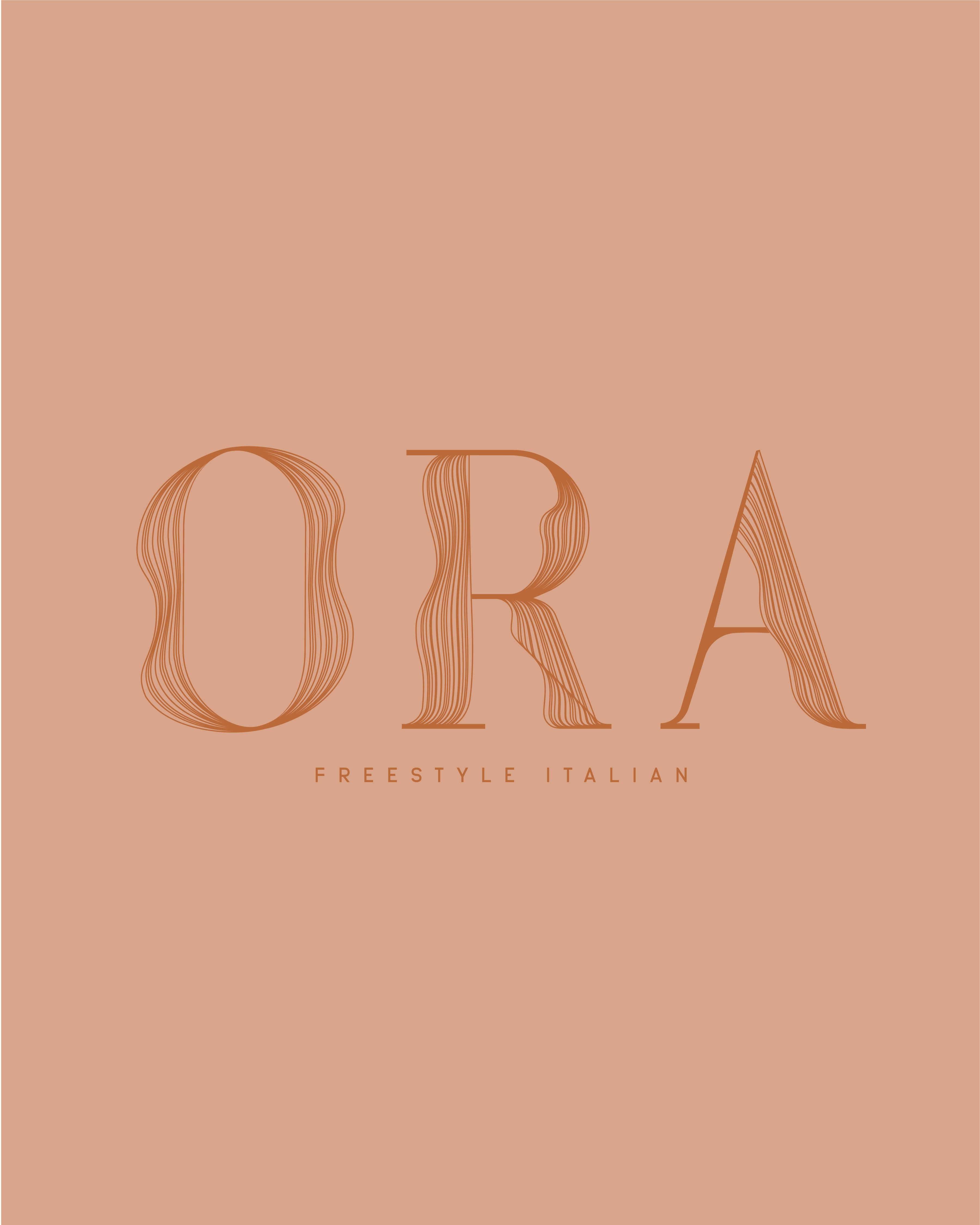
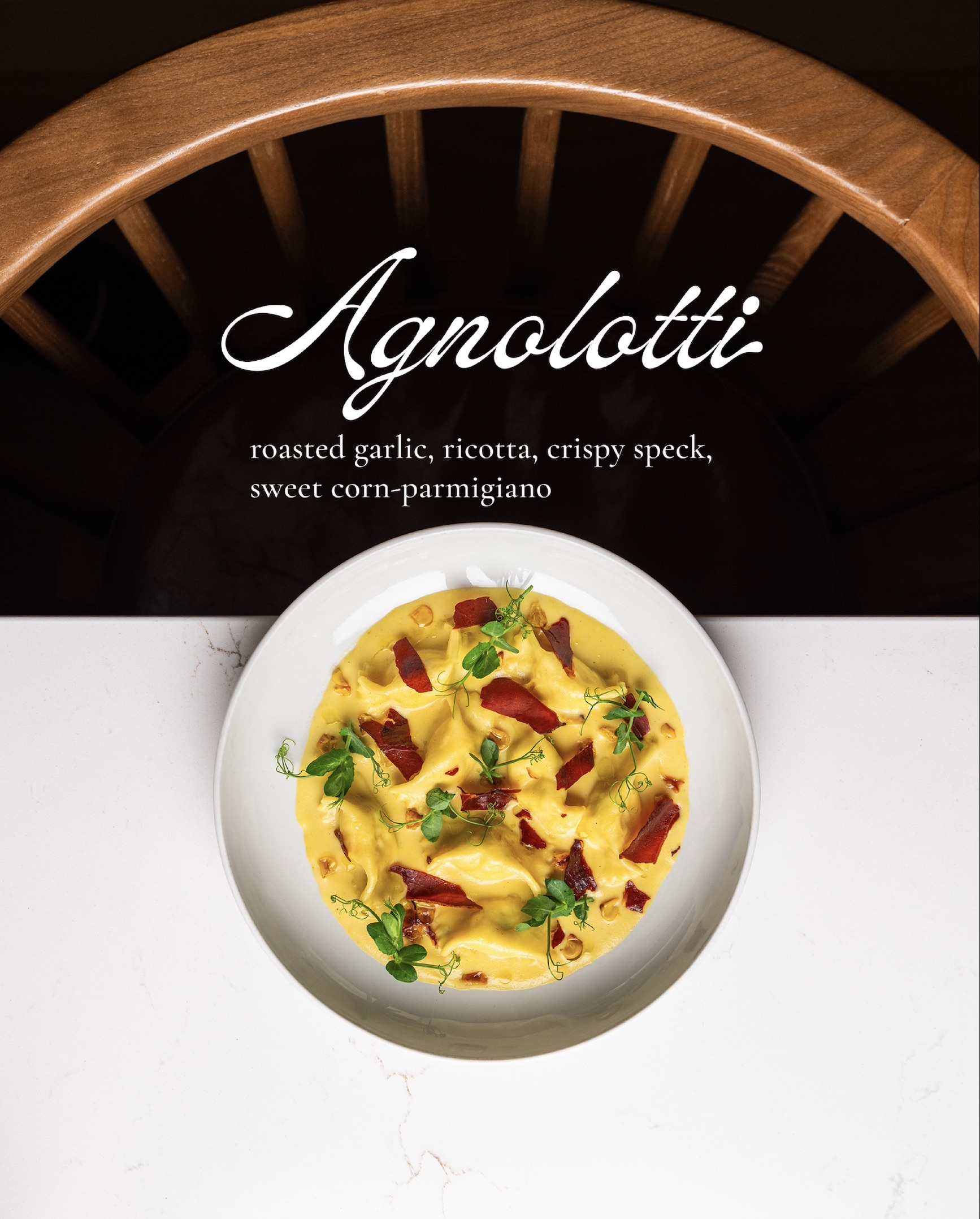
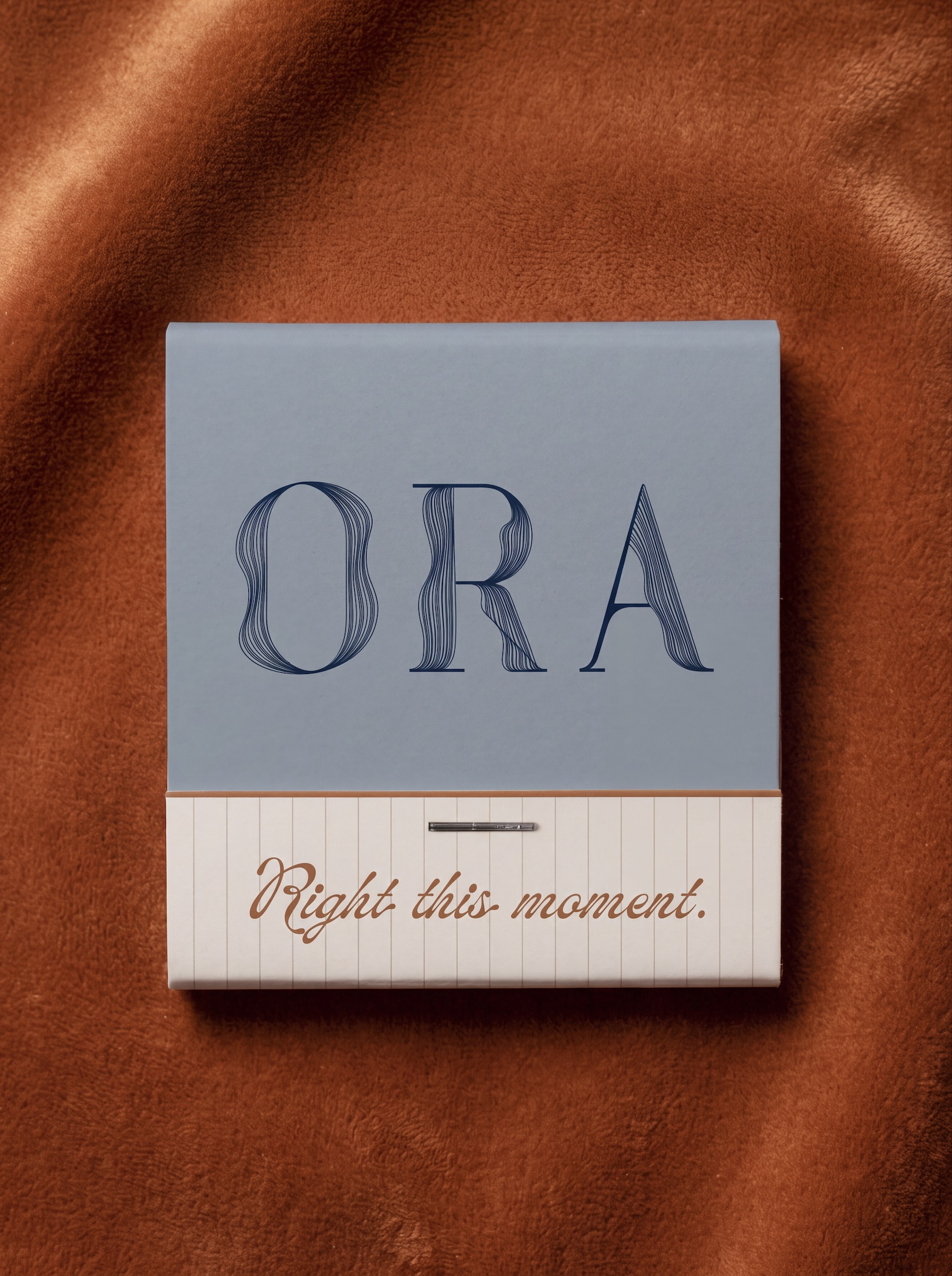
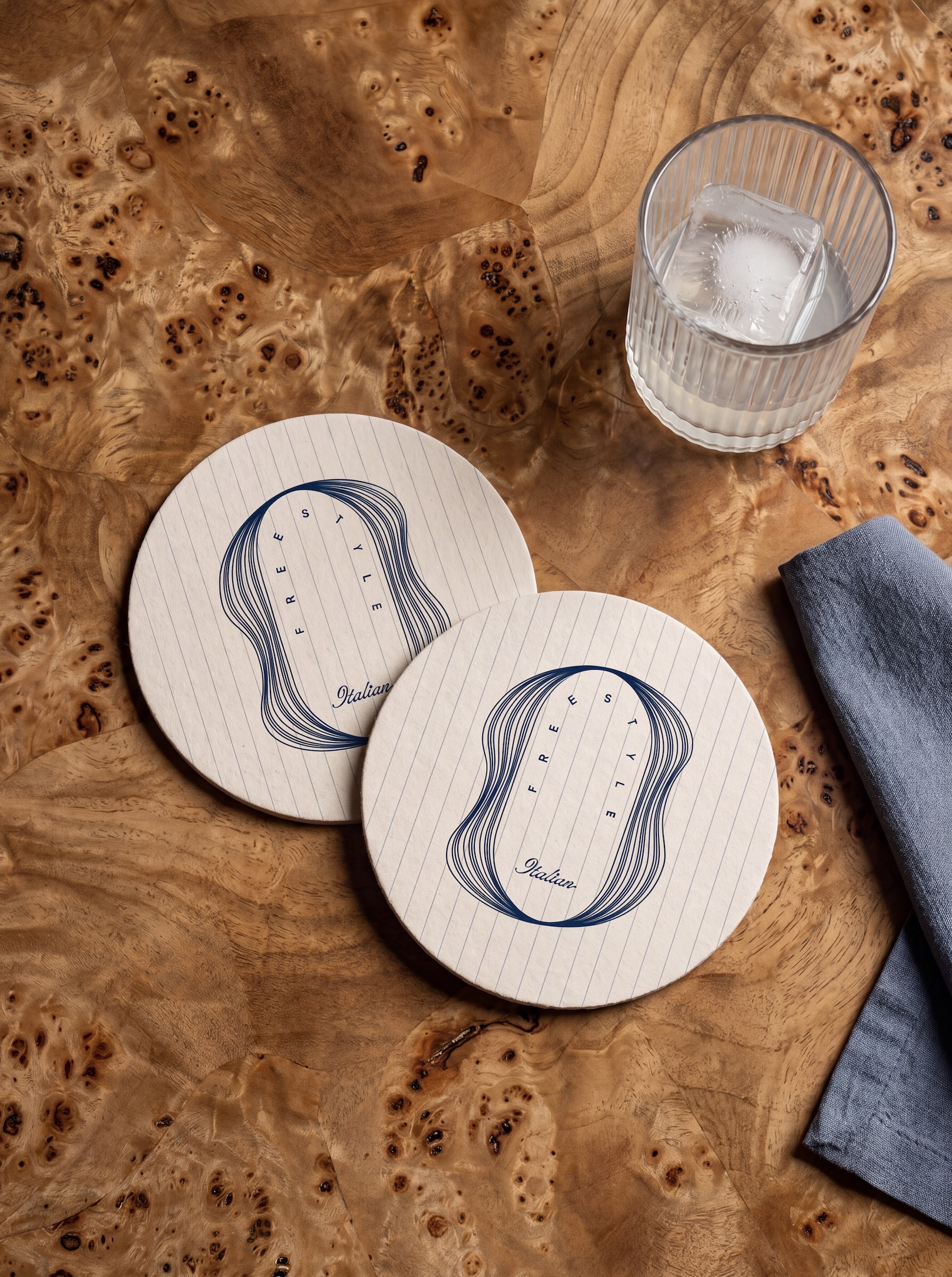
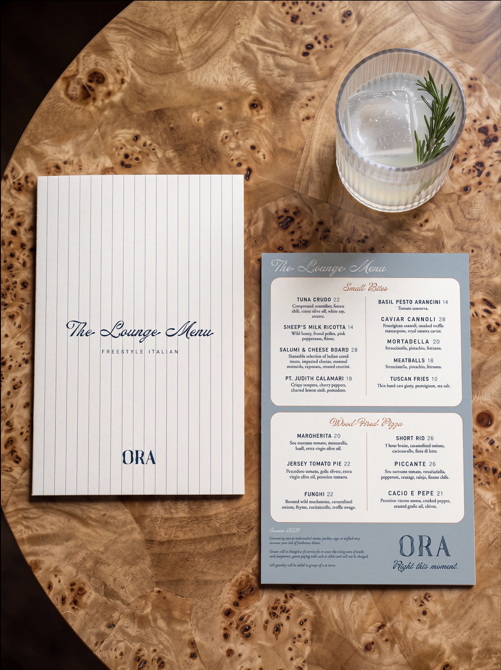
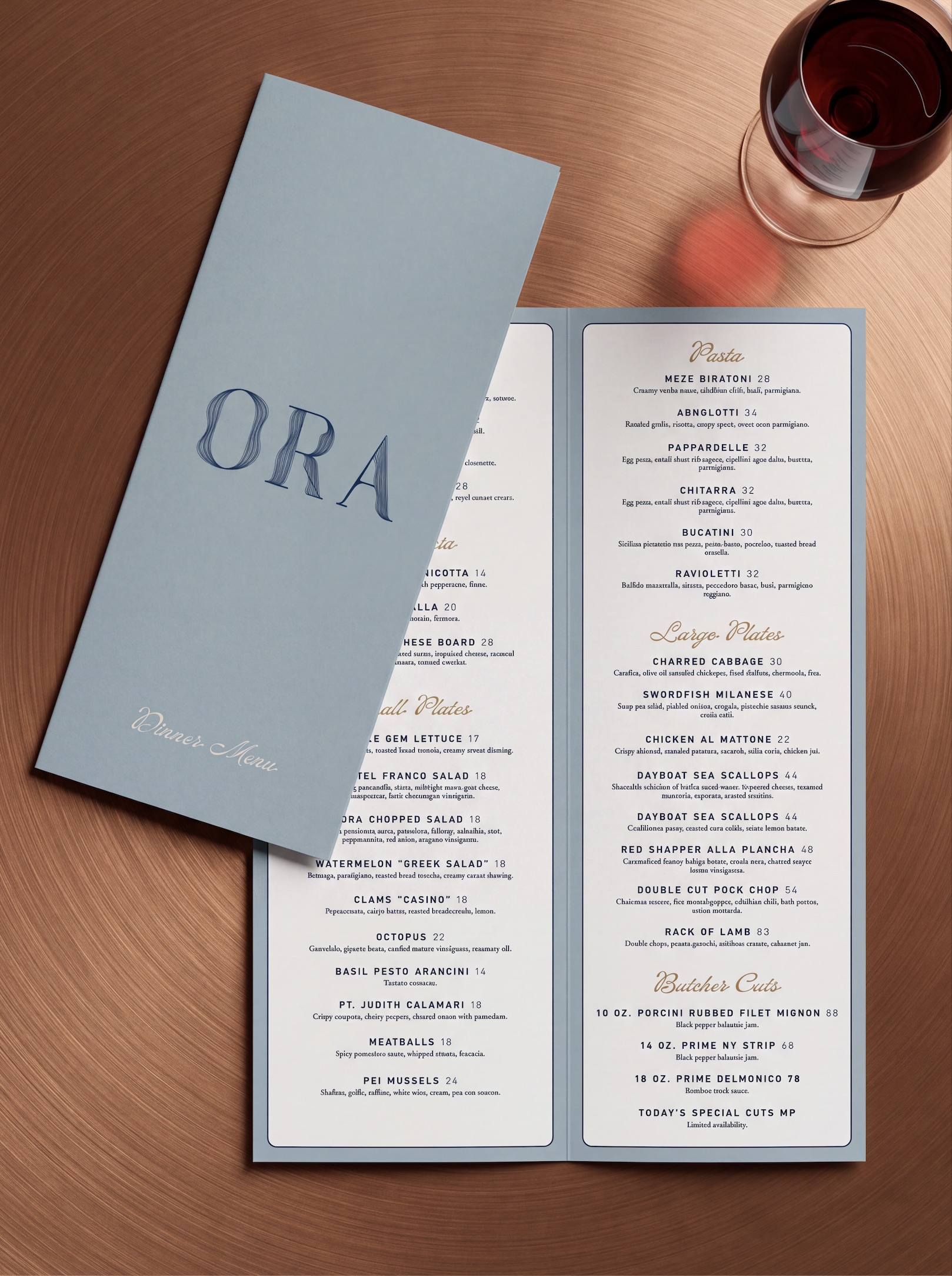
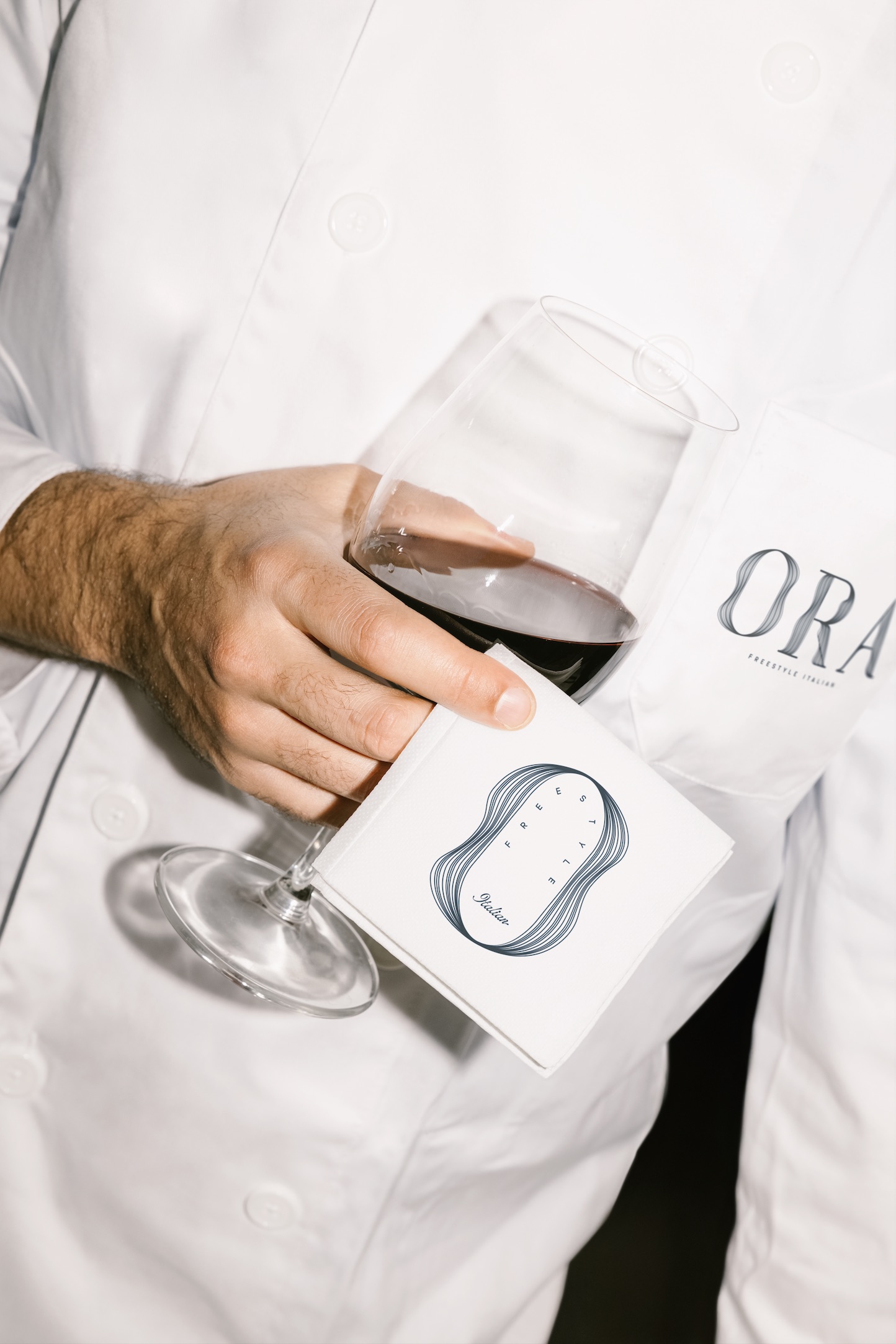
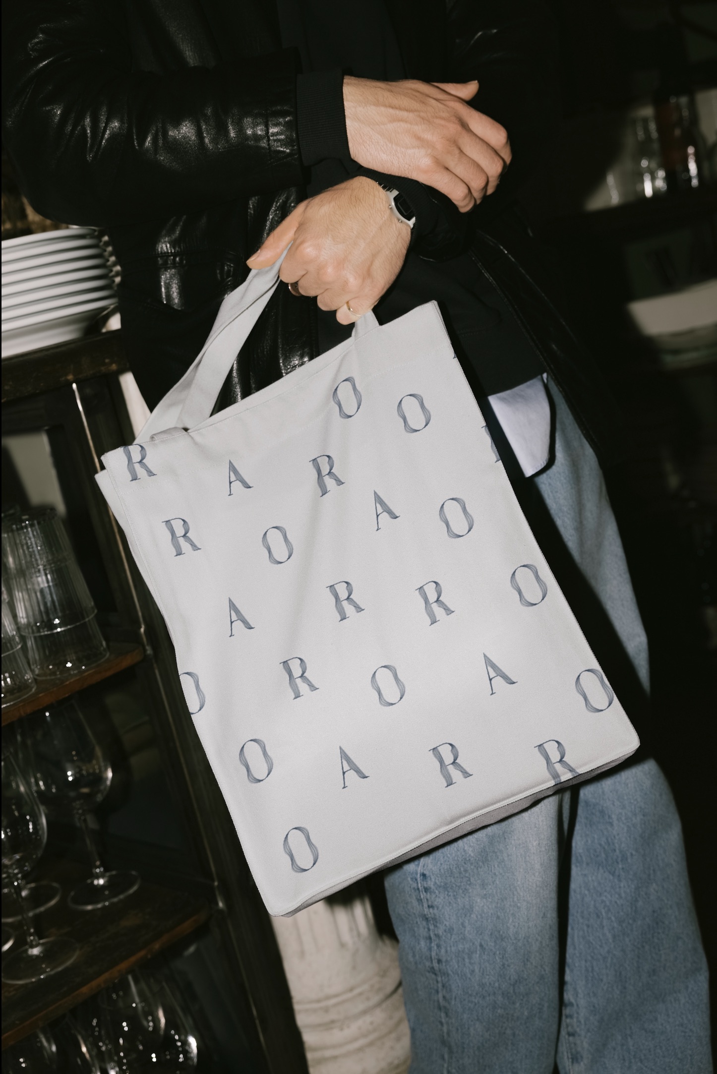
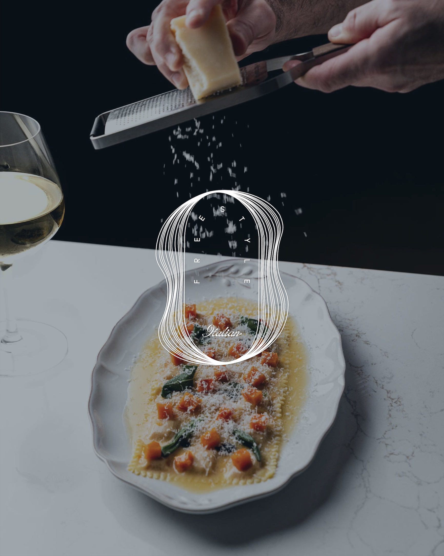
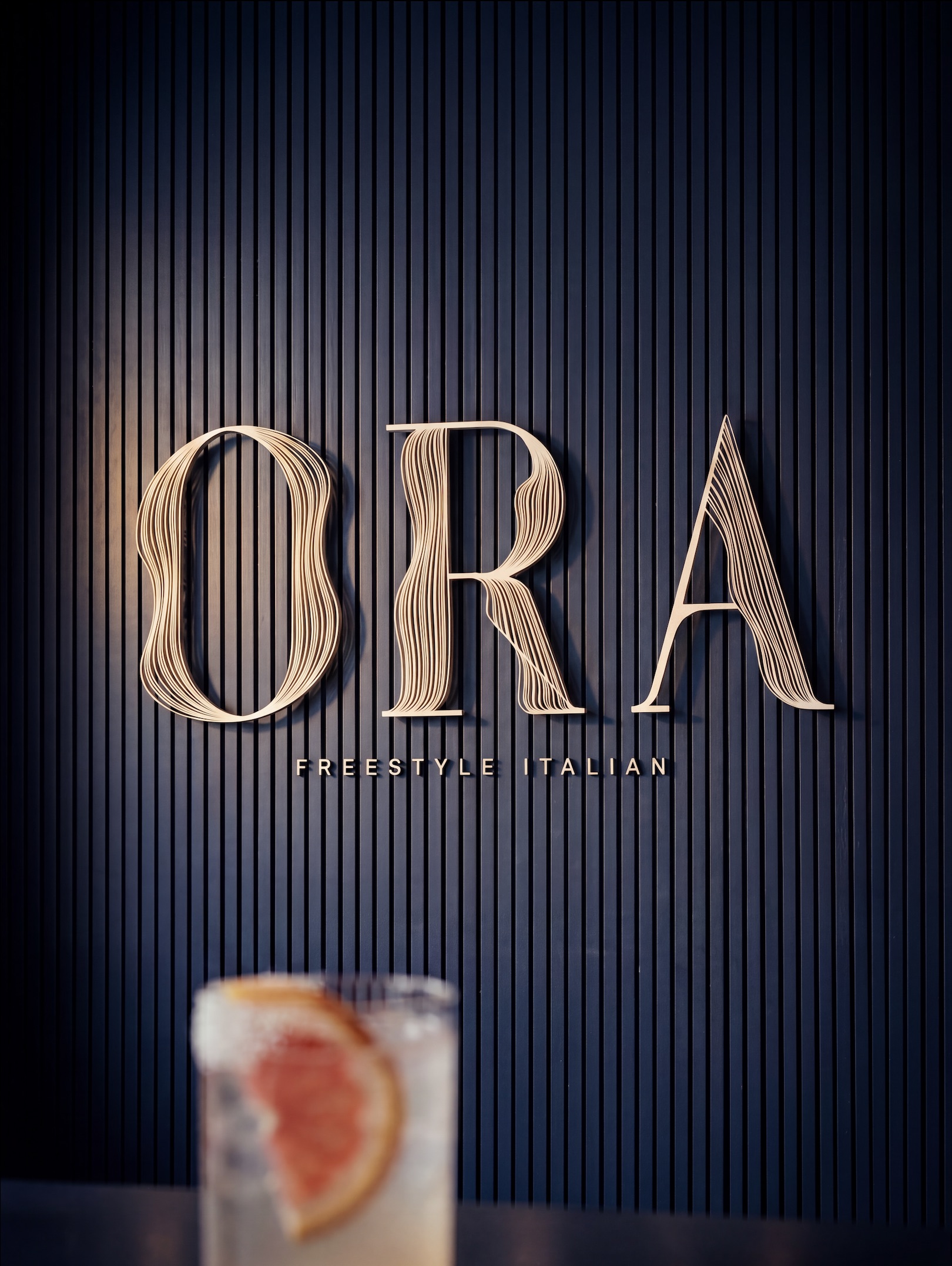
Italian restaurant branding has two default modes — rustic-traditional (red-and-white checkered, hand-painted signs, "nonna's kitchen" warmth) or modern-minimal (sans-serif wordmarks, white walls, stripped of cultural texture). Both are familiar to the point of invisibility. Neither says anything about this restaurant. ORA — meaning "now" in Italian — is built on a different premise: that great Italian cooking lives in the tension between tradition and the present moment. The recipes are old. The night is new. A plate of fresh pasta is ancient and immediate at the same time, and the brand had to honor both. The strategic move was to earn ORA's Italian heritage through craft, not symbols. No flag colors, no script-and-tomato shorthand. The wordmark is constructed like pasta — drawn by hand, layered, tactile — signaling tradition through how it's made rather than what it depicts. A brand that feels Italian without performing Italian.
Year
06.26
Scope
Branding, Web Design, Social, Strategy, Creative Direction
Timeline
6 Weeks
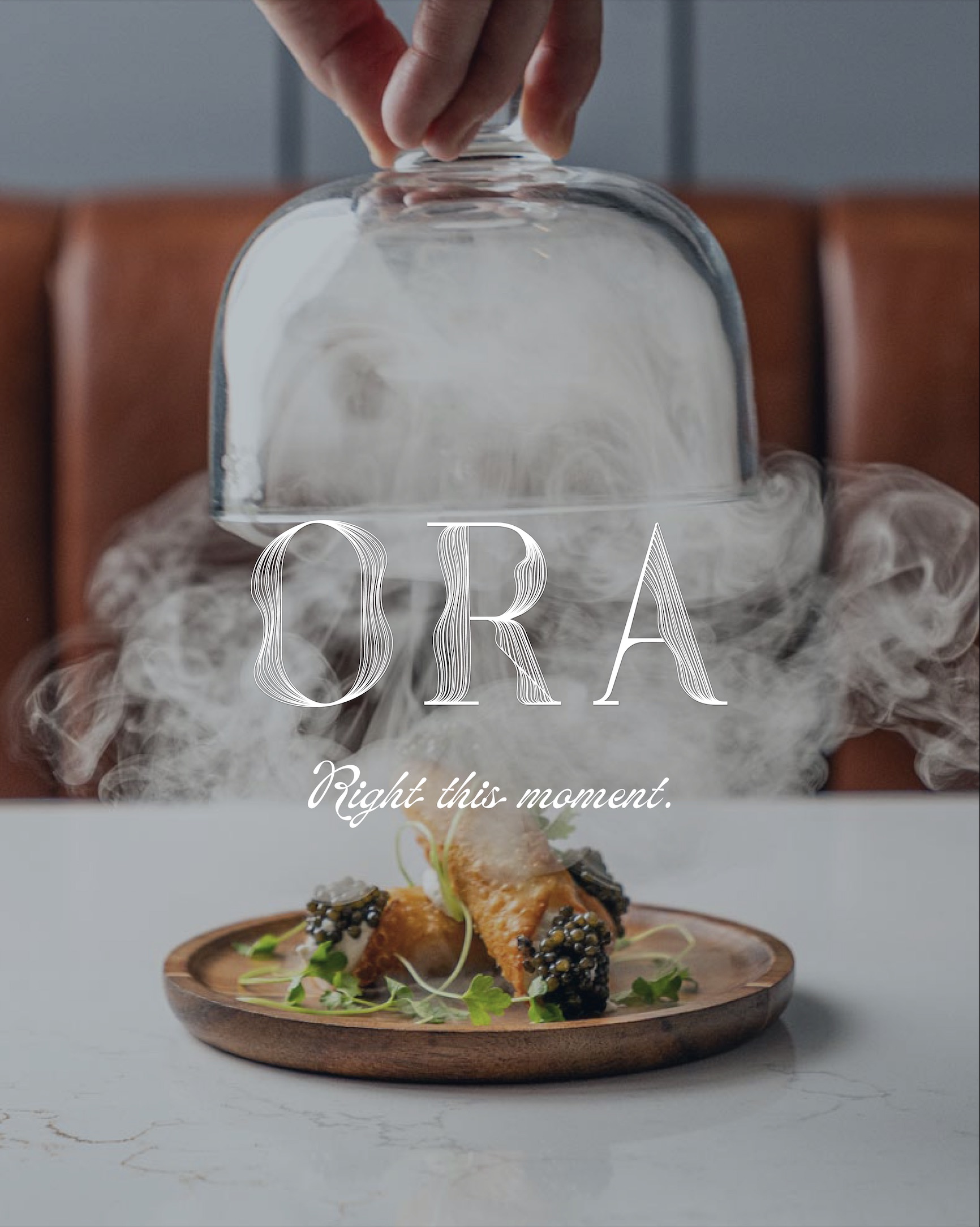
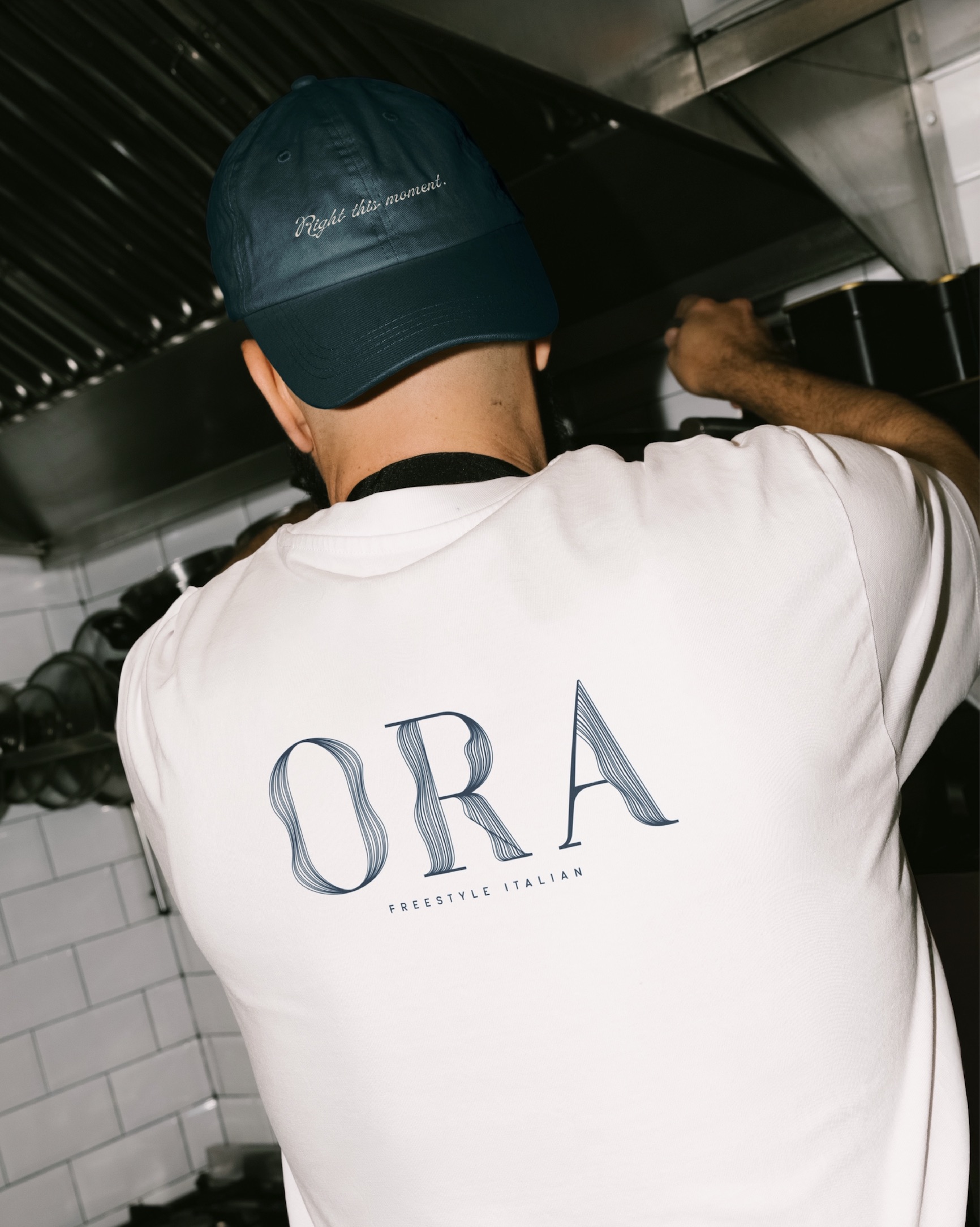
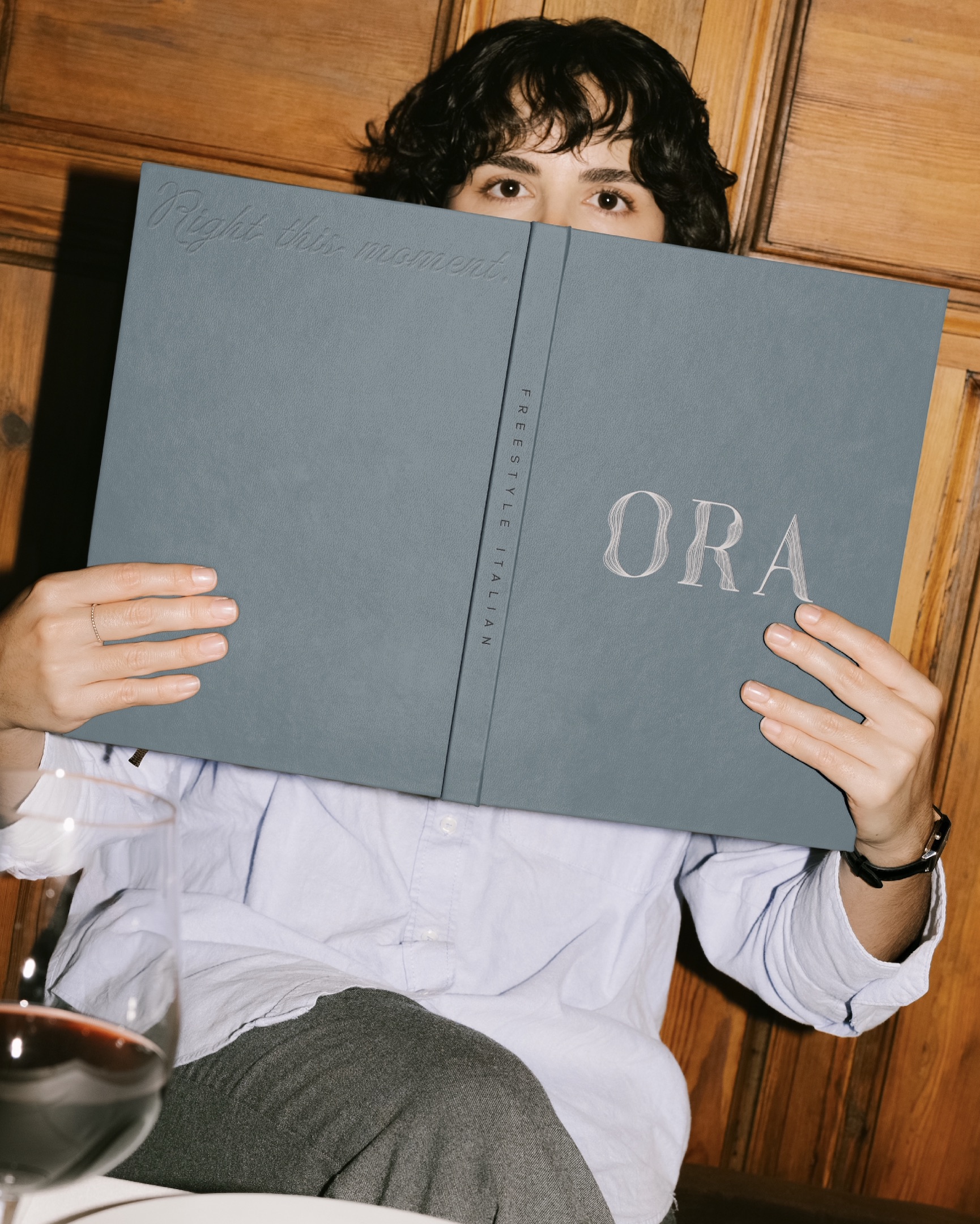
ORA means "now." The brand holds tradition and the present moment in the same breath — recipes that are centuries old, served right this minute, to someone who walked in tonight. An invitation to slow down, be present, and savor what's in front of you. Right this moment.

Have a project in mind?

I’d love to hear from you — whether you have a project in mind, or just want to say hi.
Let’s Talk
Plus icon