A version of this email shows up in my inbox almost every month now:
"Hey — I made a logo with AI and it's pretty close. Can you just clean it up and finalize it for a lower rate?"
I understand the appeal completely. What used to take a designer hours can now happen in thirty seconds and a few prompts. From the outside, branding can start to feel like a commodity pretty quickly. And honestly, for certain things, AI is useful. I use it myself. Moodboards. Copy drafts. Early visual exploration. Reference gathering. There are parts of the creative process where AI genuinely saves time. Logo design just isn't one of them.
The Problem Isn't AI. The problem is using AI for the part of branding that requires the most judgment. Because the logo itself is not the thing clients are actually paying for. That's the misunderstanding underneath most of these conversations.
The Logo Is the Cheapest Part
Not in money. In thinking. The logo is maybe 5% of the actual branding process. The other 95% is:
positioning
strategy
typography systems
color systems
hierarchy
naming logic
tone
illustration direction
how the brand behaves across real-world applications
That's the actual work. So when someone asks: "Can you just clean this up for cheaper?" what they're really asking is:
"Can we skip the entire foundation and just polish the surface?"
And the answer is usually no. Not because designers are being difficult. Because it genuinely doesn't work.
AI Generates Marks. Not Brands. This is the part most people don't realize until later. AI can generate a decent-looking image in isolation. A logo sitting on a white rectangle can look convincing for a moment. But brands don't live on white rectangles. They live on signage, menus, embroidery, websites, packaging, motion, social, business cards, presentation decks, tiny favicons, and giant building signs. Every one of those contexts has different physical and visual constraints. That's where weak branding starts falling apart. The mark might technically exist, but there's no system underneath it holding everything together. No rules. No hierarchy. No scalability. No logic for how the brand behaves across different contexts. So the first time the company needs a secondary mark, a one-color version, motion, responsive web assets, or environmental graphics, everything starts breaking. At that point, the solution usually isn't "cleaning up the logo." It's rebuilding the entire identity system from scratch. Which is the part the client was trying to avoid paying for in the first place.
What Real Logo Design Actually Looks Like
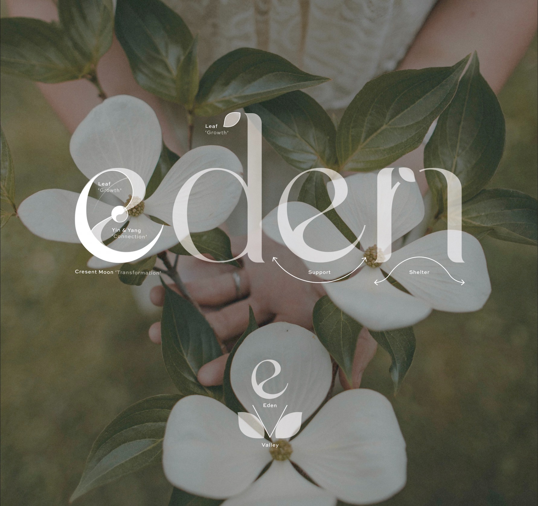
A few years ago I worked on the brand identity for Eden Valley, a mental health practice in Burlington that came to the project without a name or even an industry direction. The category had a real problem: most therapy practices use the same visual language — soft greens, watercolor gradients, generic "calm" imagery. Patients are being asked to extend trust in one of the most personal categories there is, and the branding looks interchangeable across every practice in town. The opportunity wasn't to do the genre better. It was to build a brand around a specific emotional promise: a place of growth, transformation, support, and shelter, not just another office offering therapy. The name carried the strategy first. Eden as a place of beginning and renewal. Valley as a place protected on all sides. Together: a sanctuary you grow inside of. The wordmark carried the strategy in its letterforms. Leaves crowning the d and n for growth. A crescent moon and a yin-yang form built into the e for transformation and connection. Arches between the d–e–r that read as support and shelter. Patients don't decode any of that consciously. They feel it.
Eden Valley
That kind of mark requires dozens of layered judgment calls — what the company is for, what emotion the wordmark needs to carry, which letterforms can hold which meanings, how the system reads across signage and digital and print, how everything still feels cohesive when you don't know any of the symbolism is there. AI can generate a wordmark that says "Eden Valley." It cannot make any of the decisions that make the wordmark mean what it means. That's the gap. In the first year after launch, Eden Valley saw a 90% increase in patient enrollment, fifteen times its daily inquiries, and eight new staff hires. None of that came from a logo. It came from a brand built on top of one.
It Usually Costs More
Fixing an AI-generated logo is often harder than creating a brand properly from the beginning. The designer has to reverse-engineer logic into something that was never built with any. The client thought they were saving money. Instead they created the most expensive route possible: generate something quickly, emotionally attach to it, realize it doesn't scale, pay someone to rebuild the foundation underneath it later. That's not efficiency. That's delayed cost.
The Better Question
The better question isn't: "Can you fix this AI logo for cheaper?"
It's: What does this brand actually need to do?
If the answer is "I just need a quick graphic for something temporary," then honestly, AI might be completely fine. Use it. Save the money. My own brother used it for his five-year-old’s little league team, the 'Big Bombers'. (Was I offended? Absolutely). But if the answer is, "I'm building something long-term that needs to scale, hold trust, and survive across real-world applications," then the logo is the smallest part of the investment. And the smallest part is the wrong place to optimize for cost.
——
Tucker Oelsen is a brand and web designer based in Austin, Texas, working with hospitality, luxury living, and lifestyle brands.